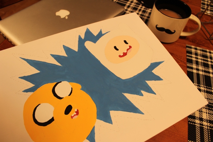
This week, I branched out into painting characters from a third television show: Adventure Time.
My goal this week was to really up the ante, step out of my comfort zone, push the envelope, and any other generic cliché that you can think of. Here are a few challenges I set out for myself:
- Putting 2 characters on the same canvas instead of only one
- Using the canvas landscape style, not portrait
- Experimenting with different colours for these different characters (not just Simpsons yellow)
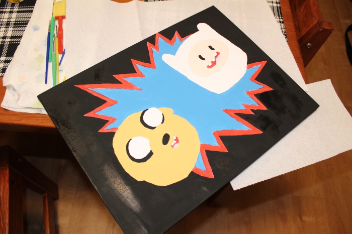
- Using darker background colours (black) instead of softer, lighter tones
- Working with 3D effects
- Using water colour
- Using black paint for important outlines and features instead of black marker
- Not copying an image directly from my computer and taking more creative liberties
- Incorporating a video into my blog post
For this Adventure Time piece, I first consulted the YouTube video below to learn how to draw Finn and Jake. This site was also helpful with drawing Finn and his features.
With their sketches done, the painting was underway. Unlike my The Simpsons characters, I did not use the darker and lighter tones effect. I kept their colours solid, much like in the actual show (Adventure Time).
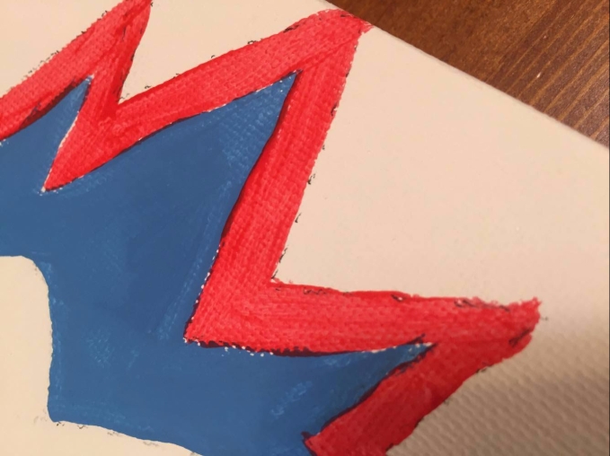
In this picture above, you can see I used red water colour paints instead of acrylic. Like the name suggests, the water colour paints are much wetter and runnier than the acrylic. This made it more challenging to stay within the lines I had set out for myself. This type of paint also didn’t cover my pencil lines as well as the acrylic, so I had to go over it several times. This site was very helpful and had a lot of good tips for working with water colours.
As mentioned earlier, in addition to the water colour challenge, I attempted to use black paint for outlining the majority of the characters’ features. I used marker for the explosion effect in the background, simply because it lends itself well to the 3D effect I was going for, however, the rest is mostly done with a thin, stiff brush, black acrylic paint, and a steady hand.
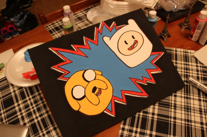
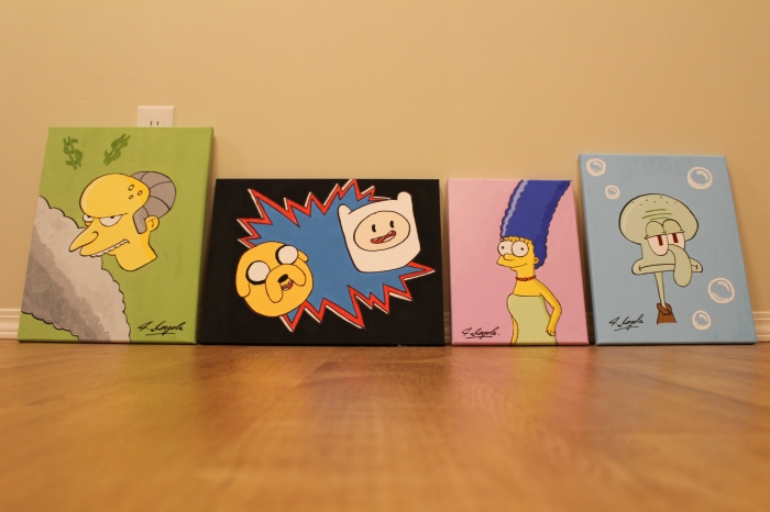
Below you can see the characters with the background coloured in, the final product for this week, and finally, my updated collection to date. Again, I feel like I have made a lot of progress, but there are still many things that I would like to improve upon. Stay tuned to more of my blog posts on this page to see what I mean.
Next week, I make a return to what interests me the most and attempt to recreate an iconic character that I have been eyeing up since this project began. See you then.
Looks awesome! I like how you post pictures of the different stages of your art. Keep up the great work!
LikeLiked by 1 person
Thanks for the support!
LikeLike
I agree! Showing the progression and stages of your paintings is a great idea and really shows the process. I’m thinking I should try to incorporate more step by step visuals in my blog posts instead of just beginning and end. Thanks for sharing!
LikeLiked by 1 person
These are great pictures. Looking forward to your next piece.
LikeLiked by 1 person
Wow, loos great! I love all your visuals and how you outlined your goals! Looking forward to your next post!
LikeLiked by 1 person
*looks
LikeLike
Thanks, everyone — It’s always great to receive positive feedback!
LikeLike
Stay consistent and sign the same way, the same spot for all your creations.
LikeLike